I attended the Machine Learning Conference in NYC last month and was lucky enough to catch a presentation by Dan Mallinger. The talk focused on properly communicating models and methods to others regardless of their technical background. The base of this communication is in understanding the model and methods we are using so that we can present them to others.
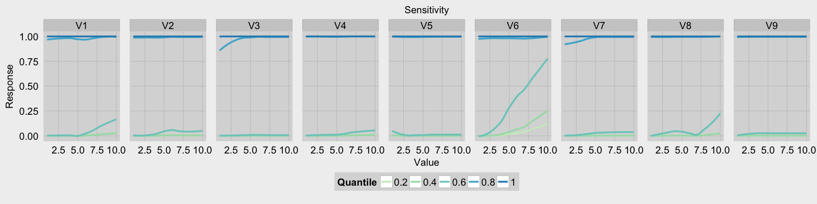
One way of gaining a greater understanding of our model is through sensitivity analysis. Through this analysis we can visualize different feature interactions and the interaction between each feature and the response. I stumbled onto Marcus Beck’s blog post on sensitivity analysis for neural networks. His post provided great detail on how to perform the analysis as well as a function for neural net sensitivity analysis. Using his analysis on neural networks as a template, I created an example using a gradient boosted tree model. The biopsy data set provided in the MASS package was used to train the model via the Caret package.
library(gbm)
library(MASS)
library(caret)
library(dplyr)
library(tidyr)
fitControl <- trainControl(method = "repeatedcv",
                           number = 5,
                           repeats = 5,
                           classProbs = T,
                           summaryFunction = twoClassSummary)

gbmFit <- train(class~., data = biopsy[,-1],
                trControl = fitControl,
                method = "gbm",
                metric = "ROC")
After training our model the next step is to generate the quantile values for each feature.
q.set <- seq(0.2, 1, 0.2)
feature.quantiles <- data.frame(apply(biopsy[,c(-1,-11 )], 2,
                                      quantile,
                                      probs = q.set,
                                      na.rm = T))
Once the quantiles have been generated sensitivity analysis can begin. For each feature of the biopsy dataset the range of possible values is generated. The response matrix is created and will be used to store the quantile, the value of the feature tested, and the response of the model.
plot.df <- NULL
# perform sensitivity analysis on all variables
# (leave out the ID and outcome)
for(i in names(biopsy[,c(-1,-11)])){
  # quantile value dictates color
  # get range of i and predic for all values
  # in the range
  var.range <- range(biopsy[,i], na.rm = T)
  possible.vals <- seq(var.range[1], var.range[2])
  response <- matrix(0, nrow = nrow(feature.quantiles),
                     ncol = length(possible.vals) + 1,
                     dimnames = list(NULL, c("Quantile", possible.vals)))
  # first column contains the quantile
  response[,1] <- q.set

  # run the model for the selected variable
  # while holding all other variables steady at a quantile
The next step is to create a test set for the model. The test set contains each value of a single feature and the quantile values for all other features.
for(j in 1:nrow(feature.quantiles)){
  test.set <- apply(feature.quantiles[j,],
                     2,function(x)rep(x,length(possible.vals)))
  test.set[,i] <- possible.vals
Now I can run the model on each value of the feature while holding the quantile values for all other features at a constant rate.
 response[j,-1] <- predict(gbmFit, newdata = test.set,
                            type = "prob")[,2]
}
After the responses from the model have been calculated I reshape and combine the results.
# reshape the response matrix for storage with other results
  temp <-  as.data.frame(response) %>%
    gather(value, response, 2:(length(possible.vals)+1))
  temp$value <- as.numeric(as.character(temp$value))
  # append the name of the explanatory variable tested
  temp$Variable <- i
  # bind all results together into one dataframe
  plot.df<- rbind(plot.df, temp)
}
The last task is to plot the analysis results in a faceted plot. To help style the plots I used the fte_theme function written by Max Woolf with few slight modifications.
# plot the values ####
palette.offset <- 3
palette <- brewer.pal("GnBu",
                      n=length(q.set)+palette.offset)[
                        seq(from = 3,
                            length.out = length(q.set))]
g <- ggplot(plot.df, aes(x = value, y = response, color = factor(Quantile))) +
  stat_smooth(size = 1.2, se = F) + labs(x = "Value",
                                         y = "Response",title = "Sensitivity") +
  scale_colour_manual(name = "Quantile",
                      values = palette) +
  scale_x_continuous(limits = range(plot.df$value)) +
  facet_grid(.~Variable) + fte_theme()
print(g)