I’ve been on a kick lately of learning how to collect, process, and analyze data collected from Twitter. I’m an MMA fight fan, so I decided to set up a stream from the Twitter API on Saturday July 11th during UFC 189. The data I’ll be using throughout the rest of this blog post focuses on the end of Rory MacDonald vs. Robbie Lawler fight, rounds 4-5, and the complete Chad Mendes vs. Conor McGregor bout. The end result of the analysis is an animation along the timeline of the fights showing tweet counts per minute, the most frequently tweeted words, and major moments during the event.
Overview of the Data
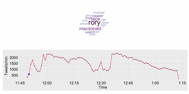
The dataset I am working with consisted of 131,148 tweets all containing the search term “UFC189”. The tweets were tokenized and cleaned to remove hashtags, urls, usernames, and stop words including the search term itself. The NLTK module in Python was used to accomplish this task. Once the preprocessing was completed, the dataset was processed in one minute windows to indentify the 25 most frequent words each minute. In addition I manually created a timeline of important events such as the beginning of a fight, end of the fight, and end of rounds based on the tweets of BloodyElbow.com and MMAJunkie.com.
Visualizing the Data
The end goal of this blog post is to create an animation. However the animation will be based on static pictures which I will create using the ggplot, wordcloud, grid, and gridBase packages. To start things off I’m going to import my data.
library(lubridate)
library(ggplot2)
library(wordcloud)
library(animation)
library(gridBase)
library(grid)
library(dplyr)
options(warn = 1)
source("fte_theme.R")

# atlantic timezone offset (+ 12 hour offset)
atlantic.time.offset <- 4*3600

# ds contains the top word frequencies per minute
ds <- read.csv("data/word_frequencies_binned.csv", header = F)
names(ds) <- c("token", "count", "time" )
ds$time <- ymd_hms(ds$time)

# Import and preprocess data #####
# tweets contains the original dataset with all tweets
# collected
tweets <- read.csv("data/ufcTest.csv")
tweets$created_at <- strptime(tweets$created_at,
                          '%a %b %d %H:%M:%S +0000 %Y',
                          tz = "GMT")
tweets$created_at <- ymd_hms(tweets$created_at)
# append a column containing the hour:minute the tweet occurred in
tweets$hour_minute <- floor_date(tweets$created_at, unit = "minute")

# event text tweets:
# a list of important events along with the
# hour:minute they occurred
event.timeline <- read.csv("data/eventTimeline.csv")
event.timeline$created_at <- mdy_hm(event.timeline$created_at)


# get tweet count per minute##
tweets.per.minute <- tweets %>% group_by(hour_minute) %>%
  summarise(
    tweet_frequency = n()
  )

# join the timeline events to the
# tweet frequency count for each minute
tweets.per.minute <- left_join(tweets.per.minute,
				event.timeline,by = c("hour_minute" = "created_at"))
Below is a small description of the dataframes which were imported:
- ds: This dataframe contains 3 columns: token, count, and time. These are the top 25 tokens which occur during each minute along with the frequency with which the token occurred in that window.
> head(ds)
      token count                time
1      rory   170 2015-07-12 03:50:35
2      face    97 2015-07-12 03:50:35
3 macdonald    93 2015-07-12 03:50:35
4    lawler    75 2015-07-12 03:50:35
5     watch    70 2015-07-12 03:50:35
6 live 70 2015-07-12 03:50:35-
tweets: The dataframe is the original dataset containing all tweets. This is only used to provide a tweet frequency per minute value.
-
event.timeline: The timeline of major events previously discussed.
The tweets and event.timeline dataframes are joined to provide major events along with the frequency of tweets at each minute.
> head(tweets.per.minute)
Source: local data frame [6 x 3]

          hour_minute tweet_frequency                            tweet
1 2015-07-12 03:49:00             288                               NA
2 2015-07-12 03:50:00             588                               NA
3 2015-07-12 03:51:00            1429                   Robbie is hurt
4 2015-07-12 03:52:00            1781  Round 4 Over - Momentum to Rory
5 2015-07-12 03:53:00            1291                               NA
6 2015-07-12 03:54:00            1009                               NA
The timeline of tweet count per minute annotated with major events is created using ggplot2. The word cloud is created with the wordcloud package. To stack the plots over one another in a single window requires the grid and gridBase packages. Below is the print_stacked_plots function which does the following:
- Creates the base timeline plot which contains the hour and minute on the x-axis and the number of tweets during that minute on the y-axis.
- For each unique minute in the data:
- Create a word cloud.
- Create grid for to place word cloud and timeline in.
- Highlight current time on timeline and annotate if a major event is occurring.
- Save the plot to a file.
# print word clouds stacked
# on top of timeline
print_stacked_plots <- function(ds, tweets.per.minute){

  # get unique timeline windows (83 total)
  time.intervals = unique(ds$time)
  # create base frequency timeline plot
  frequency.timeline.plot <- draw.frequency.plot(tweets.per.minute)

  for( i in 1:length(time.intervals)){

    # open up a file to save the plots in
    png(filename = paste0("data/plots/wordcloud_",
    	formatC(i, width=3, flag="0"),".png"),
         width=800,height=400, units='px')

    # width = 800, height = 400)
    par(mfrow = c(2, 1))  # 3 rows and 2 columns
    # draw the word cloud
    wc <- draw.wordcloud(ds[ds$time == time.intervals[i], ])
    # get the margin values from the first plot
    wc.plot.margins <- par("mai")

    # set up the grid space to
    # stack the wordcloud over the ggplot plot
    plot.new()
    vps <- baseViewports()
    pushViewport(vps$figure)
    # set the margins for the second chart to the same as the first
    pushViewport(plotViewport(margins = wc.plot.margins)) ## I use 'wc.plot.margins' to set the margins


    # select the tweet frequency for
    # the hour:minute during this iteration
    current.tweet <- tweets.per.minute[
      tweets.per.minute$hour_minute == floor_date(time.intervals[i],
                                                  unit = "minute"),]

    # highlight the current point in time
    # on the tweet frequency timeline
    p <- frequency.timeline.plot +
      geom_point(data = current.tweet,
        aes(x = hour_minute-atlantic.time.offset, y = tweet_frequency), size = 4,
        color = "#756bb1") +
      scale_x_datetime(labels = c("11:45",
                                  "12:00",
                                  "12:15",
                                  "12:30",
                                  "12:45",
                                  "1:00",
                                  "1:15"))

    # check if any annotation of a major event is present
    # if an event is present add it to the plot
    if(!is.na(current.tweet$tweet)){
      p <- p + geom_text(data = current.tweet,
                         aes(x = hour_minute-atlantic.time.offset,
                             y = tweet_frequency,
                             label = tweet), fontface = "bold", hjust = 0, size = 7)
    }
    grid.draw(ggplotGrob(p)) ## draw the figure


    dev.off()
  }

}
The functions for drawing the word cloud and base timeline tweet frequency plot can be found below.
# function for creating the word cloud ##
draw.wordcloud<-function(ds){
a<-wordcloud(ds$token,ds$count,
scale= c(2.5, 0.5),rot.per=0,
max.words = 15,
random.order = FALSE,
colors=c("#9ebcda",
"#8c96c6",
"#8c6bb1",
"#88419d",
"#810f7c",
"#4d004b"))
}
# creates a timeline plot of tweet frequency
draw.frequency.plot <- function(tweets.per.minute){
frequency.timeline.plot <- ggplot(tweets.per.minute,
aes(x = hour_minute - atlantic.time.offset,
y = tweet_frequency)) +
geom_point(color = "#7A99AC") +
geom_line(color = "#E4002B") +
labs(y = "Tweets/min", x = "Time") +
fte_theme()
return(frequency.timeline.plot)
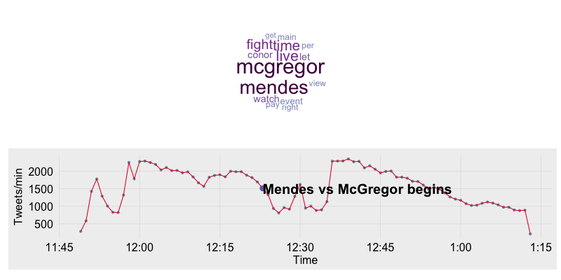
} The word cloud was set up to only show the 15 most frequent words and all words were set to the same orientation. The settings were tuned in this manner to ensure consistency between plots. The event timeline is a basic ggplot2 line plot. I also use the fte_theme to help style the plot. Below is the plot at the beginning of the Mendes/McGregor fight.
Animating the Timeline
The end result of running the print_stacked_plot function is 83 individual image files which will then be converted into a single gif using the animate package. In my example I will also be the im.convert function which is a wrapper for ImageMagick. You will need to download and install ImageMagick to use the im.convert function.
# print and save the stacked plots
print_stacked_plots(ds, tweets.per.minute)

## set options for gif
# one second delay between images
oopt = ani.options(interval = 1)
# convert images to gif
im.convert(files = list.files("data/plots/", full.names = T),
           output = "wc_animation.gif")
The resulting animation is shown below. In the animation you will see Lawler’s and MacDonald’s names as the most prominent in the beginning. Once the walkouts start for the McGregor/Mendes fight “Sinead” comes up as frequent word as Sinead O’Connor performed “Foggy Dew” for the McGregor walk out. Once the McGregor/Mendes fight starts their names are the most prominent. After the fight has finished words such as “featherweight”,”McGregor”, and “Champion” become most prominent.
