What is it?
Exploratory data analysis (EDA) is the process of reviewing your data to get a sense of what you are dealing with. Statistics derived from our data can give us a good idea of what is going on, but data visualization often gives a clearer picture.
In this post I’m only going to touch on two types of visualizations: histograms and scatter plots. There are plenty of other visualizations out there, but these are two that are normally the first ways I will visualize data.
What is it used for?
It is often the first step in solving any data related problem. You need to know what you are dealing with before you can propose a plan on how to attack (regardless of application - prediction, correlation, ANOVA, etc.)
It is used to answer the following (amongst other things):
- What is the range of my data?
- Where is my data centered?
- How spread out is my data?
- What distribution is my data from?
Obviously we can calculate statistics for each of the above questions, but visualizations help us get the whole picture at once.
Terminology
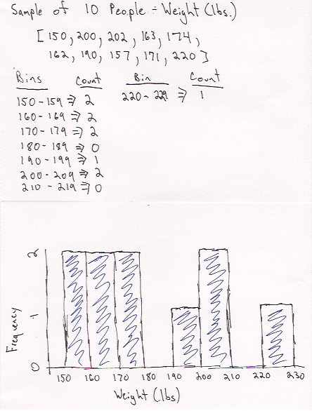
- Histogram: Bar chart that has multiple equal sized bins (intervals) on the x-axis which represents the range of data values for a single variable. The y-axis is the frequency, or count, of the number of samples in a specific range.
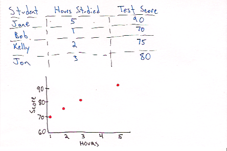
- Scatter Plot: A plot normally used to plot a dependent variable (y-axis) against an independent variable (x-axis). For example, score on an exam (dependent) versus hours spent studying (independent). In general, it can be used to compare any two variables so long as they are matched. For example, say I want to compare the weight (x-axis) and height (y-axis) of different individuals.
When Should I Use This?
Use:
Histogram
Histograms are great for getting a high level view of a single variable. We
can use mean, median, and standard deviation to get a sense of the data, but a
histogram fills in some of the gaps. It makes it easy to identify any issues
our descriptive statistics are unable to tell us. For example I may have a
bimodal distribution or a heavily skewed distribution.
Example of a Bimodal Distribution
Scatter Plot
Scatter plots should be used when you want to identify a trend or relationship
between two variables which are paired (i.e. they were measured for the same
subject or sample).
Don’t Use:
Histograms
To identify the relationship between two variables.
Scatter Plot
To investigate the distribution of a single variable.
Assumptions, Prerequisites, and Pitfalls
Histograms
Be mindful of bin size. If your bin sizes are too wide you will not be able
to see the shape of your sample. See the examples below for the same data:
Bin size of 0.25
Bin size of 4
Scatter Plot
Make sure you are plotting paired data. To clarify this means make sure if
you are plotting subject A’s height, don’t plot it against subject B’s weight.
Always make sure it is subject A’s weight against subject A’s height,
subject B against B, etc.
Example - No Code
Scatter Plot

Histogram

Example - Code
Python & Matplotlib
import numpy as np
import matplotlib.pyplot as plt

# histogram
n = 1000
x = np.arange(0,n)
value = np.random.randn(1,n)[0]
plt.figure(figsize=(8,2), dpi=72)
plt.hist(value)
plt.show() # show plot
# uncomment next line if you want to save plot to svg
# plt.savefig('histogram_py.svg', format='svg')
# clear figure
plt.clf()
# scatter Plot
n = 100
m = 0.2
x = np.arange(0,n)
y = m*x + np.random.randn(1,n)[0]
plt.figure(figsize=(8,2), dpi=72)
plt.plot(x, y, 'o')
plt.show() # show plot
# uncomment next line if you want to save plot to svg
# plt.savefig('scatter_py.svg', format='svg')R & ggplot2
library(ggplot2)

# Histogram
n <- 10000
df_histogram <- data.frame(n = 1:n, y = rnorm(n))
ggplot(df_histogram, aes(x  = y)) +
  geom_histogram(fill = "#E4002B", color = "#7A99AC")
# Scatter Plot
m = 0.2
x <- 1:100
y <- m*x + rnorm(length(x))
df_scatter <- data.frame(x,y)
ggplot(df_scatter, aes(x = x, y = y)) + geom_point() 


